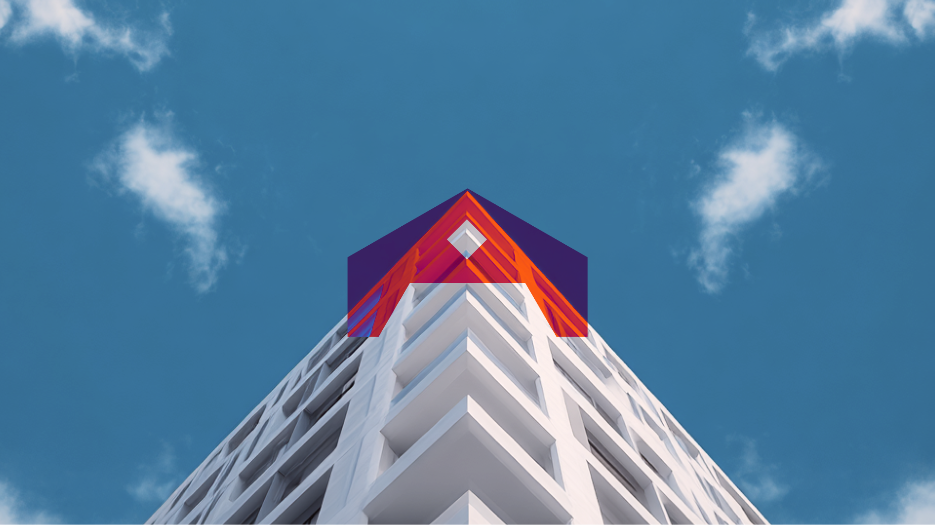
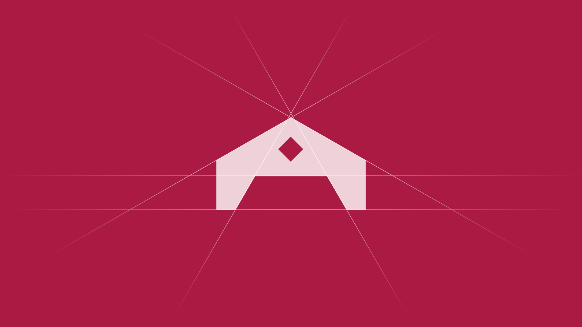
The mark is a shelter reduced to its purest geometry. A strong angular roofline, two grounding walls, and an open threshold beneath. Not a house, but the idea of one. The diamond at its centre is a single point of tension, a detail that holds the eye without explaining itself.
Construction lines radiate from that apex outward, revealing the precision behind the form. Nothing was placed arbitrarily. The mark communicates strength and permanence through proportion alone, no ornamentation, no literalism.
Against deep crimson, the soft blush of the symbol creates a tonal contrast that feels restrained and intentional. A mark built to be engraved, embossed, and remembered.
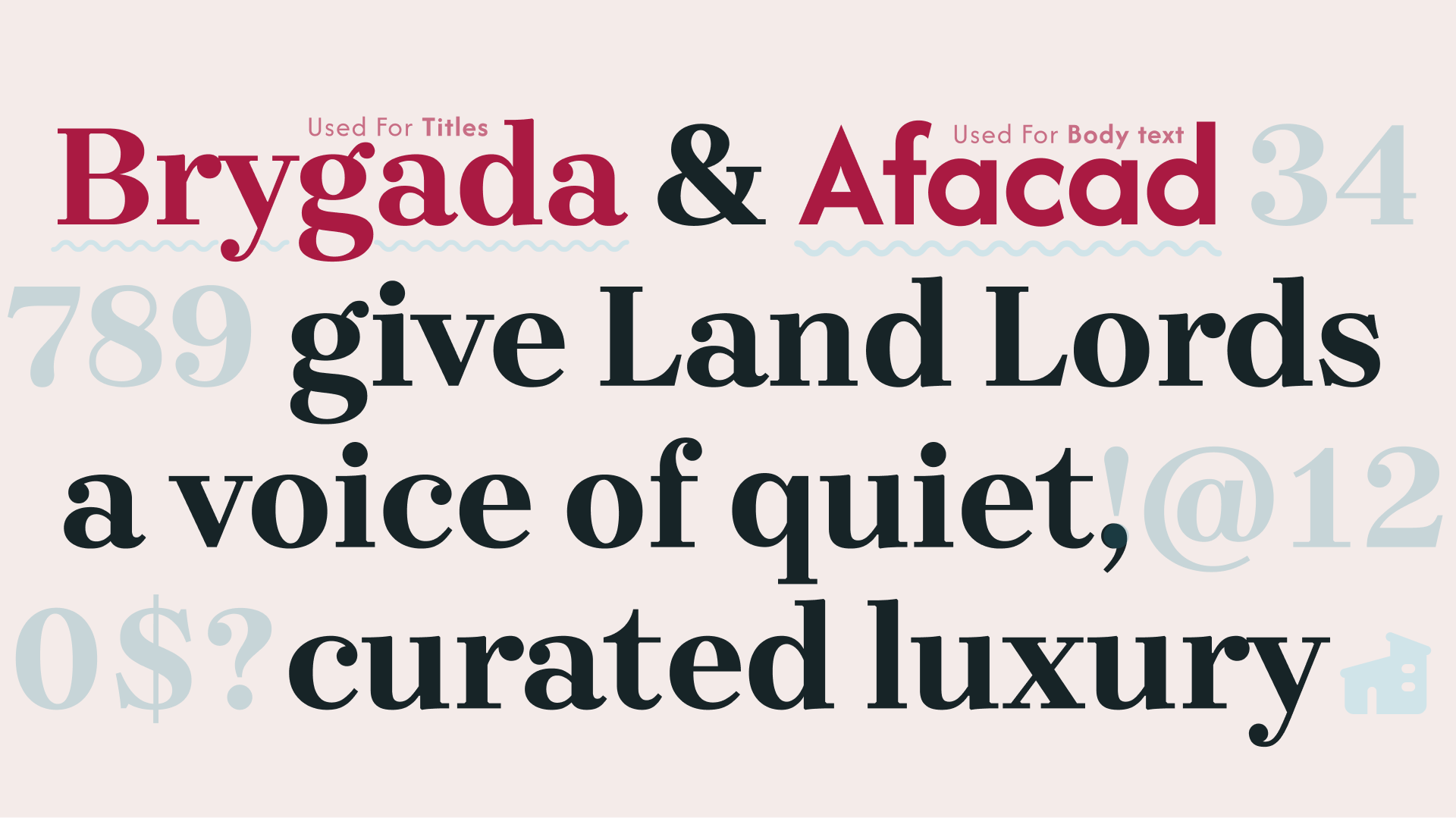
Brygada for titles, Afacad for body. The choice is deliberate. Brygada brings editorial weight and high contrast strokes that carry the brand’s authority across headlines and property names. Afacad keeps everything functional underneath clean, legible, unobtrusive. Together they create a voice that is confident without being loud. One typeface earns attention. The other holds it.
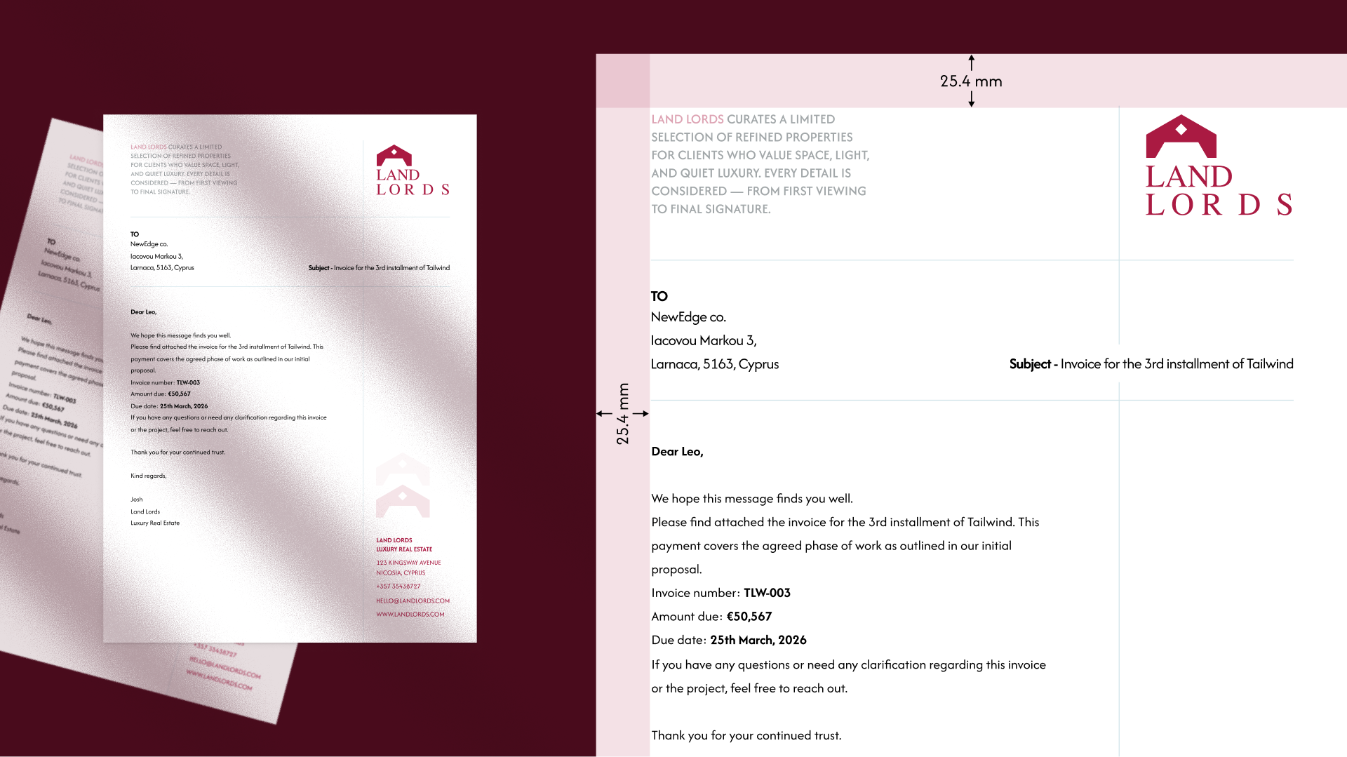
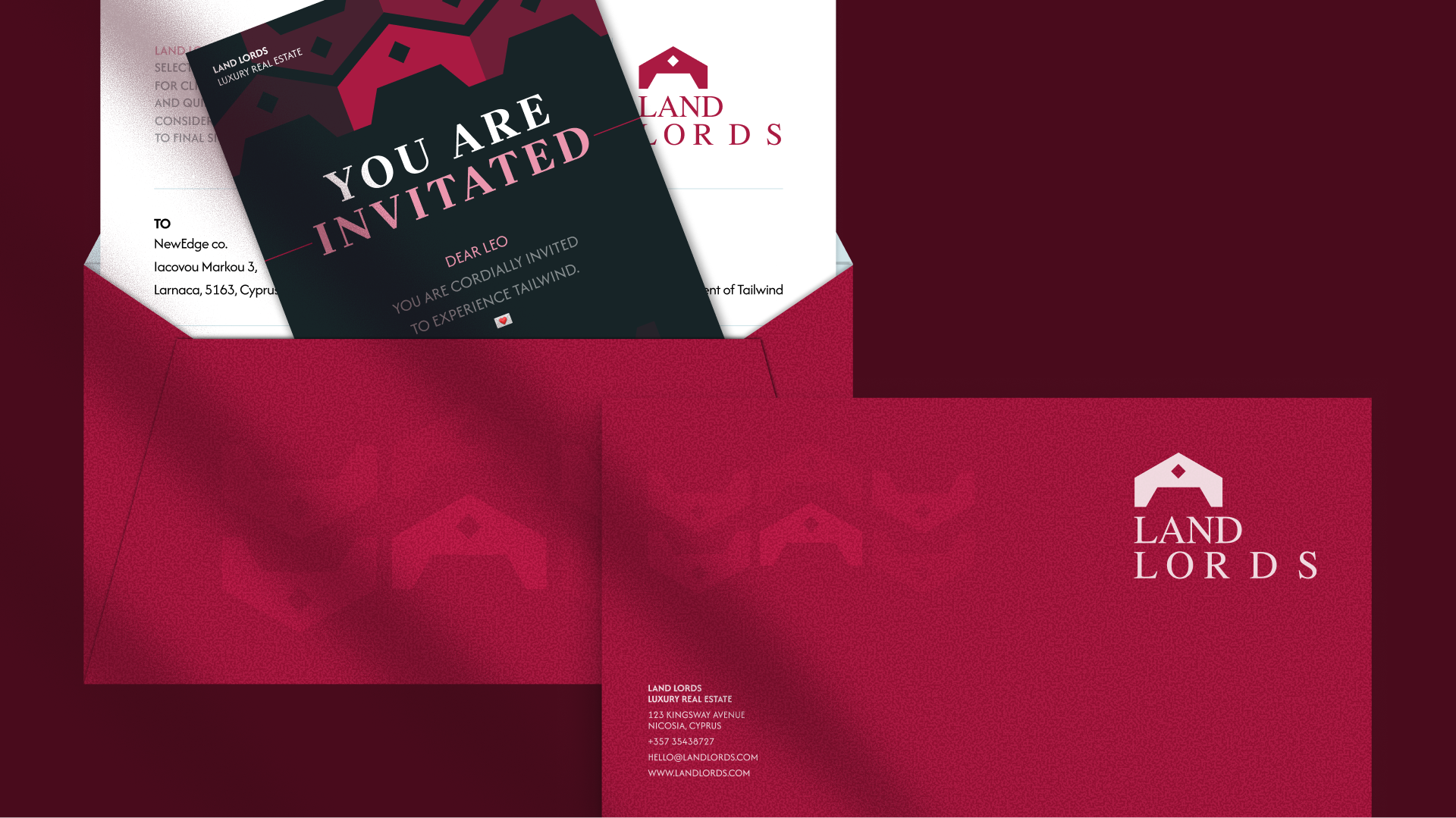
Every physical touchpoint was treated as a brand moment, not a formality. The letterhead carries the mark with restraint, contact details structured with the same hierarchy as the identity itself. Envelopes printed in full crimson, the mark embossed into the surface, turning a standard mailing into something a recipient notices before they open it.
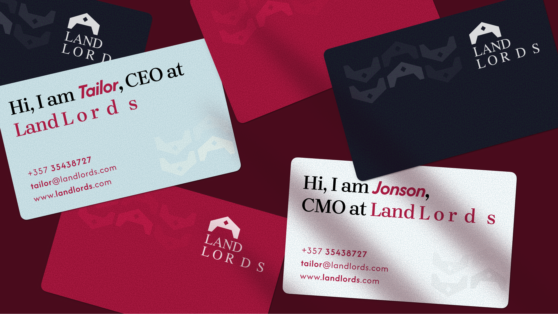
The business cards break from convention. Each card introduces the person by name, leading with personality before title. Ice blue, near black, and crimson variants give the team individual presence while staying within the same system. The mark repeats as a background texture, subtle enough to feel like craft rather than pattern.
Every piece was designed to be kept. That is the real measure of print collateral at this level.
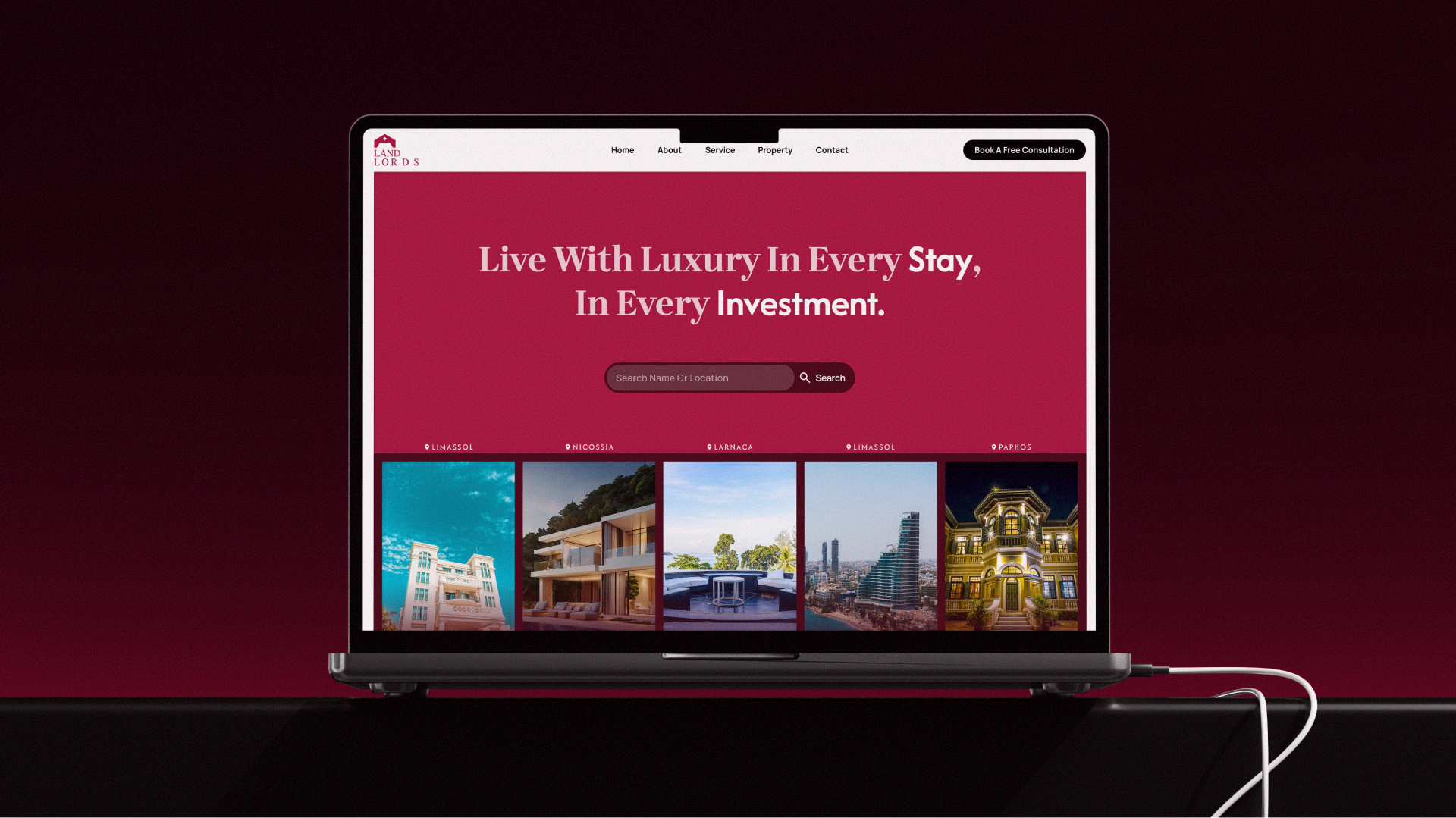
The website leads with intent. A headline that speaks to lifestyle and investment simultaneously, a search field that respects the user’s time, and property listings organised by city. No filler, no friction.
The brand doesn’t announce itself. It simply shows up, consistently, across every pixel.
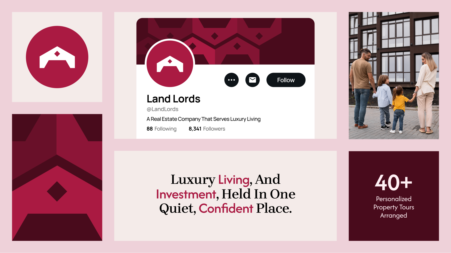
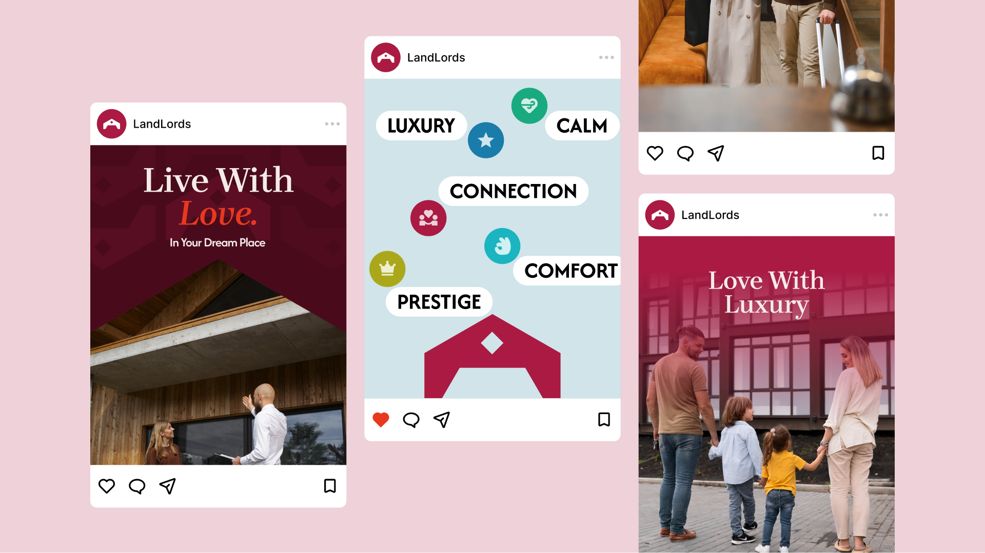
The brand translates to social without losing any of its authority. The mark holds at profile size. The content system moves between editorial statements, lifestyle imagery, and data moments. Each post a different expression of the same idea. Luxury living and serious investment, held in one place.
The voice stays consistent whether it is a headline, a number, or a family standing in front of their next home.